- Playbook
- Attribution
- Paid Media
- Google Sheets
- Reporting
- B2B SaaS
- Dashboard
- CRM Export
- CPL
- ROAS
Build Your Own B2B Paid Media Attribution Dashboard in Google Sheets
A step-by-step guide for digital and performance marketers to build a paid media attribution dashboard in Google Sheets, from raw CRM data to channel performance, multi-touch attribution models, and full-year pacing.
Why I built this
Every paid media manager eventually hits the same wall. The BI tool is misconfigured. The Salesforce admin changed a field without telling anyone or removed it without communicating it across the marketing org. Bizible stopped firing on a key page a week ago and nobody noticed. The QBR is in 48 hours and now the dashboard you were going to present is pulling garbage data.
This is not a hypothetical. It happens at well-funded, well-staffed companies with dedicated marketing ops teams. When it happens, you will consider two options: either delay the meeting, which you know will be impossible, or build the view yourself.
I built this guide to ensure you do not grow gray hairs or force yourself into exile.
Starting from a raw CSV export (or working with your MOps team to pull the right fields dynamically into Google Sheets via data syncing) and ending with a framework that covers every conversation you will need to have with senior leadership across a full fiscal year. Channel performance, attribution modeling, monthly pacing, deal efficiency by buyer seniority: all of it, in a Google Sheet you fully control.
I built a mock version of this using a fictional B2B SaaS company called Syncflow. You can download the template, explore how the formulas work, and replace the raw data tab with your own CRM export. The live interactive version lives at jjcruzgalera.com/tools/attribution if you want to explore it before downloading. You likely will not need all the tabs and tiles, so I will also cover what your MVP could look like.
What this covers and what it does not
Before we get into the build, let me set expectations.
This framework covers:
- Channel-level performance (leads, MQLs, SQLs, closed-won, CPL, ROAS). This will be part of your MVP
- Multi-touch attribution modeling with four model types
- Seasonality-adjusted monthly and quarterly pacing against annual goals: this will be part of your MVP
- Deal efficiency by buyer seniority and sales motion
- A channel role reference that explains programmatic and G2 to a CFO without you having to improvise
This is not:
- A real-time reporting tool. It is a structured analytical layer you build on top of a periodic CRM export
- A replacement for Bizible, Marketo Measure, or Looker when those tools are working correctly
- A beginner's introduction to spreadsheets. You should be comfortable with pivot tables and basic formulas before you dig in
Think of it as the floor. When your stack is working, you go higher. When it breaks, you land here and keep moving. I recommend building this and running it in the background so you will not have to start from scratch when any of your BI systems break. You should also get into the habit of creating a sandbox where you test new tiles, data pulls, and analysis.
The data model: how B2B CRM exports work for attribution
The foundation of this entire framework is a flat CSV with one row per touch per prospect. That structure is intentional. Please do not get hung up on the actual numbers since this is a mock dataset.
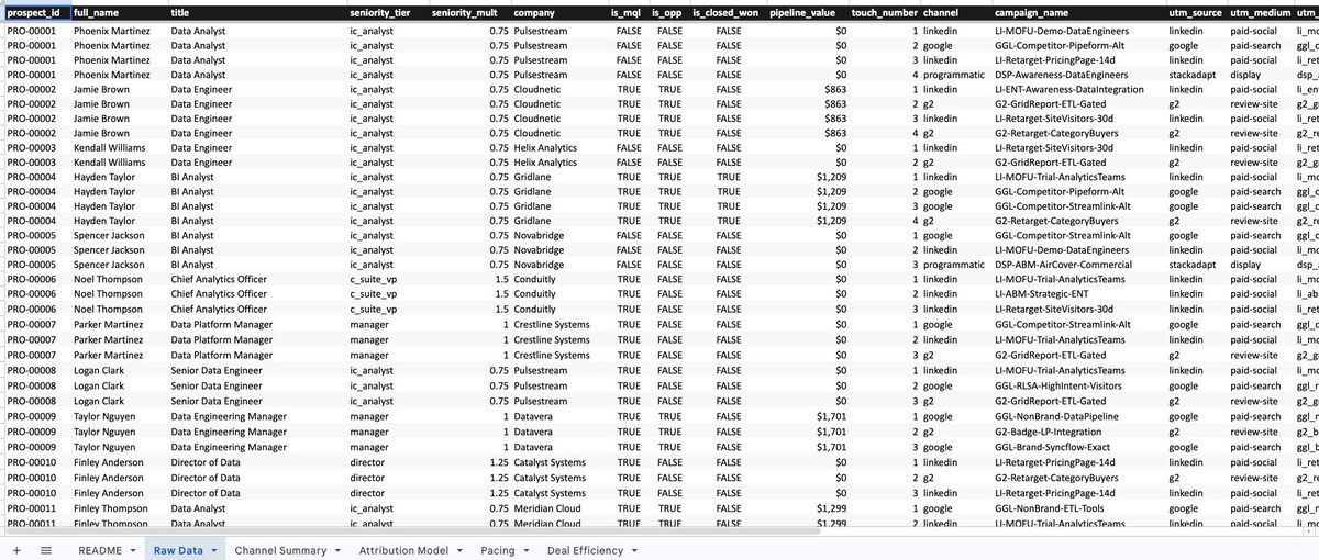
Most CRM exports come out this way: one row per activity, not one row per person. A prospect who touched LinkedIn, then G2, then Google before converting will appear three times in your export. That is not a bug. It is the raw material for attribution modeling.
The Syncflow mock dataset includes 9,378 unique prospects across 27,610 rows. Each row contains:
Prospect-level fields: a unique ID, full name, job title, seniority tier, company, and whether they became an MQL, SQL, opportunity, or closed-won deal. These are consistent across all rows for a given prospect.
Touch-level fields: the channel, campaign name, touch number, form type (demo request, trial signup, gated content download, newsletter signup), and a full UTM string (source, medium, campaign, content, term). These vary by row because each row represents a different interaction.
Why this structure matters: when you want to count leads, you count unique prospect IDs. When you want to model attribution, you use every touch row and apply weights. The same export does both jobs. You just need to know which calculation to use when.
If you are pulling from your own CRM, a Salesforce report that joins Activities or Campaigns to Contacts and Opportunities will give you the same structure. The column names will be different. The logic will be identical.
Your MVP: start here
If you are new to performance marketing or building your first reporting framework, do not try to build all six tabs on day one. Start with three.
This dashboard is thorough by design, and it covers almost everything you will need to communicate to senior leadership throughout a full fiscal year. But you do not need all of it on day one. You need enough to run your first meeting with confidence.
Tab 1: Channel Summary (MVP). This is the table you will be asked to explain in every meeting. Leads, MQLs, SQLs, closed-won, CPL, and ROAS by channel. Depending on your company's growth strategy and goals the focus may shift, but you will most likely be asked about MQLs, SQLs, and ROAS by channel and motion. Keep in mind ROAS should be focused on closed-won, but given long sales cycles you will most likely track it against sales pipeline, which is a leading indicator.

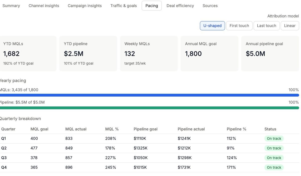
Tab 2: Pacing (MVP). This is the table that saves your quarterly review. Monthly MQL and pipeline actuals versus seasonality-adjusted goals with on track, at risk, and behind indicators. It answers the question "Are we going to hit our goal this quarter?" before anyone has to ask it. I would also recommend linking to any weekly or monthly performance reporting decks that will provide the "why we are pacing at X" context.
Tab 3: Attribution Model (MVP). This is the table that makes you sound like a senior marketer: four models, one dropdown, instant toggle. When a CMO asks "How much of this pipeline should we attribute to LinkedIn?" you have a defensible answer regardless of which model they prefer. Keep in mind that depending on the capabilities of your tech stack this may or may not be easy to implement. If you are running incrementality tests you should reference those findings within this section as well.
Build those three tabs first. Get comfortable with the formulas. Then add Deal Efficiency and the README once you understand what each number means.
Tab by tab: how to build each section of your paid media dashboard
Channel Summary
The Channel Summary tab answers the most fundamental question in paid media: which channels are working for us?
The table is built by deduplicating the raw data by prospect ID, assigning each prospect to their primary channel based on first touch, and then counting unique prospects at each funnel stage. CPL is the total channel spend divided by the number of unique leads generated from that channel. At the channel summary level this gives you an efficiency benchmark across your full program, not a campaign-by-campaign view. For campaign-level CPL, drill into the Raw Data tab and filter by campaign name. ROAS is attributed pipeline divided by annual spend.
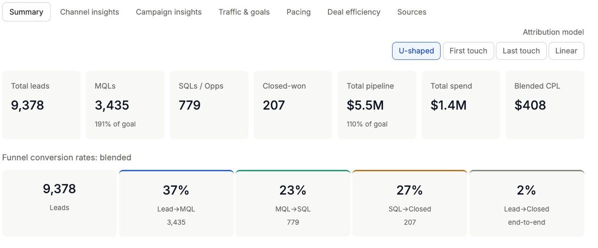
Why this matters in a leadership conversation: CPL without context is just a number. CPL with a benchmark range attached to it (LinkedIn should run $80 to $130, Google Ads $75 to $200) becomes a decision-making tool. If you walk into a meeting and LinkedIn CPL is $180, the question is not "is this bad?" It is "what changed, and what are we going to do about it?" The benchmark turns a data point into a conversation. Also, some leaders or even other departments will say they do not care about lead volume, but in reality some of these channels will be the life source of your database and there should always be a well thought out nurture program targeting them.
The ROAS column uses U-shaped attribution as the default, the same model that anchors the Attribution Model tab. That means the first and last touches each get 40% of the credit, with middle touches splitting the remaining 20%. It is not perfect, but it is the most defensible model for a B2B SaaS business where both demand creation and demand capture matter.
Note: ROAS and CPL benchmarks apply to LinkedIn and Google Ads only. G2 and programmatic operate on structurally different spend and volume dynamics. Applying the same benchmarks produces misleading conclusions. The note row at the bottom of the table exists to pre-empt that conversation before it starts.
Attribution Model
The Attribution Model tab is where the analytical depth lives.
Four models, computed from the same underlying touch data, show how pipeline credit shifts depending on how you weight the buyer journey.
U-shaped credits first and last touches equally at 40% each, with middle touches splitting 20%. This is the default because it respects both the channel that created awareness and the channel that closed the deal.
First touch gives 100% credit to the channel that introduced the buyer to your brand. This model is your best argument for awareness spend. When someone questions why you are running LinkedIn campaigns that do not directly generate demos, first touch shows you the pipeline those campaigns started before any other channel got involved.
Caveat: first touch is only as clean as your lookback window. If your CRM does not have a defined cutoff, first touch can pull interactions from years ago, crediting a 2021 whitepaper download for a 2024 closed deal. Or even worse, someone might have entered the lead into the system manually and sent an email, and now it shows that the first touch was actually an email. Yes, you will see this happen and wonder why your team is counting email as first touch. Before presenting first touch data to leadership, confirm with your marketing ops team what the lookback window is and when it was last audited.
Last touch gives 100% credit to the final interaction before conversion. It favors demand capture channels like Google branded search, G2 retargeting, email, and demo request campaigns because those tend to be the last click before a form fill.
It is also the most dangerous model to rely on for budget decisions. Every channel that was not the final click goes fugazy. The LinkedIn campaign that started the conversation, the programmatic air cover that kept you top of mind: none of it gets credit. If leadership uses last touch to allocate budget, demand generation channels will lose funding every year not because they stopped working, but because the model never showed their contribution. And you will start looking like a cost center more than a revenue-generating engine.
Use it to understand what triggered conversion. Do not use it to justify where you spend. You can always add a few tiles focusing on the last touch that generated the MQL.
Linear splits credit equally across every touch. It is the most democratic model and the hardest to argue with, but it tends to undersell both awareness and closing channels simultaneously.
The dropdown in cell B2 controls which model the selected model results table displays below. Show your leadership team how the story changes when you toggle between models. The conversation about what attribution actually measures and what it cannot is one of the most valuable you can have with a CMO or VP of Revenue.
Pacing
The Pacing tab solves a problem most paid media managers do not realize they have: flat monthly goals. Your goals should also follow last year's organic traffic fluctuations and trends.
If you divide your annual MQL goal by 12 and call that your monthly target, you are setting yourself up to look behind in January and March and ahead in May and October, not because performance changed, but because B2B buyer behavior is seasonal. Your audience is not evenly distributed across the calendar.
This tab weights monthly goals against a traffic index derived from historical organic session patterns. If May historically drives 10.5% of annual traffic and December drives 3%, then May should carry a proportionally larger share of the annual MQL goal. Your paid media targets should reflect the market, not a spreadsheet formula.
The attainment indicators (green for 95% or above, yellow for 80 to 94%, red for below 80%) give you an instant read on where you stand without having to calculate anything. That is the output you want in a monthly business review. Not a table of numbers. A table of numbers with a clear signal.
Deal Efficiency
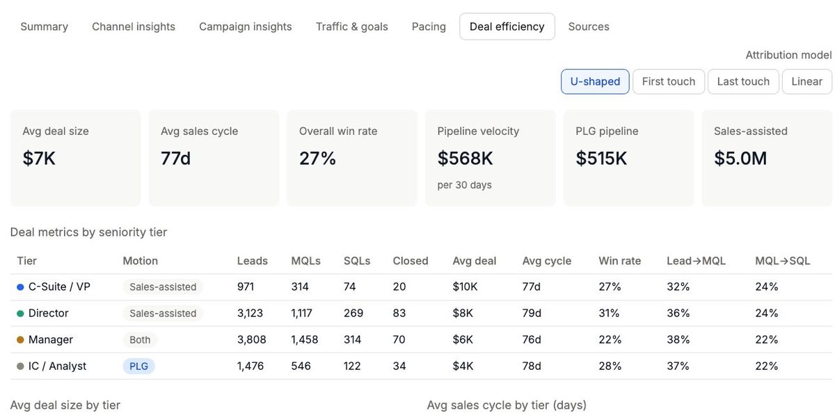
The Deal Efficiency tab is the one most performance marketers skip and the one that most impresses senior finance and revenue leadership when you include it.
It answers three questions that channel-level reporting cannot: who are we actually closing, how long does it take to get there, and does my current targeting reflect the buyers most likely to convert at the deal size we need?
The seniority breakdown shows leads, MQLs, SQLs, closed-won, average deal size, average sales cycle, and win rate by buyer tier. A C-Suite or VP buyer closes in approximately 70 days with a higher average deal size. An IC or analyst closes in 30 days with a lower ACV but a faster cycle. Neither is better. They serve different sales motions and require different targeting strategies. If your win rate is strong at the Director level but your campaigns are over-indexed toward ICs, that is a targeting conversation worth having before the next budget cycle.
The channel role reference table at the bottom is not a computed output. It is a static reference that frames every other number on the dashboard. LinkedIn is demand generation. Google Ads is demand capture. G2 is a closing validator. Programmatic is air cover. When someone asks why programmatic has near-zero standalone ROAS, you point to this table. That is its job. Without this context, someone in finance will try to cut programmatic based on direct attribution alone and they will not be wrong by their logic. This table is how you get ahead of that conversation.
How to replace the mock data with your own CRM export
The Raw Data tab is designed to be replaced. Here is how to do it without breaking the downstream formulas.
Step 1: Pull your CRM export. From Salesforce, run a report that joins Contacts or Leads to Campaign Members or Activities, with Opportunities joined via the Contact ID. You want one row per campaign touch for each contact, including opportunity stage and amount.
Step 2: Map your columns to the template schema. The columns the downstream tabs depend on are: a unique prospect identifier, a primary channel field, MQL status, opportunity status, closed-won status, pipeline value, seniority or job level, and a month or date field. Rename your columns to match the template headers exactly.
Step 3: Paste over the Raw Data tab. Delete the existing data, paste yours in, and keep the header row intact. The formulas in the other tabs reference named ranges or column letters, so as long as your data starts in row 2 with headers in row 1, everything will recalculate automatically.
Step 4: Update the spend inputs. The Channel Summary tab has annual spend values hardcoded for each channel. Update those cells to reflect your actual budget allocation. CPL and ROAS will update immediately.
Step 5: Update the annual goals. The Pacing tab has annual MQL and pipeline goals at the top. Replace those with your actual targets. The monthly breakdown will recalculate based on your seasonality index.
If your data is clean and your column mapping is correct, the whole dashboard updates in under five minutes. At minimum make sure your MVP tabs are displaying correctly and you can slowly build the rest back up.
What a full fiscal year looks like using this framework
I would advise against trying to build the entire dashboard in one run: it is not a one-time build. It is a recurring artifact that you will have to adjust, optimize, and cross-reference against other channels and reporting tools when pipeline looks off and you need to investigate.
At the start of the year, you use the Pacing tab to set seasonality-adjusted monthly targets and present them to leadership. That conversation anchors expectations before the first campaign launches.
When you update the Raw Data tab with a fresh CRM export (if you are not doing a full automated data sync from your CRM), confirm the performance indicators and walk through the Channel Summary in your monthly business review: two slides, ten minutes, no surprises.
You will use the Attribution Model tab to make the case for budget allocation when needed. Which channels are generating first-touch pipeline? Which are closing deals? Where are you hitting diminishing returns? The model toggle gives you four different angles on the same question.
At the end of the year, the Deal Efficiency tab tells you whether you were reaching the right buyers. If your C-Suite win rate is high but your IC volume is low, you may be over-indexed on enterprise and leaving commercial pipeline on the table. If your average sales cycle is longer than the benchmark, you have a qualification conversation to have with sales, or a nurture program to review, depending on the challenge.
That is a full year of senior leadership communication, built on a single Google Sheet and a disciplined CRM export process.
Frequently asked questions
What is the difference between CPL and cpMQL? CPL (cost per lead) is your total channel spend divided by the number of leads generated. cpMQL (cost per marketing qualified lead) is your total channel spend divided by the number of those leads that met your MQL threshold. cpMQL is the more meaningful metric because it accounts for lead quality, not just volume.
Which attribution model is best for B2B paid media? U-shaped attribution is the most defensible starting point for B2B SaaS. It credits first touch and last touch equally at 40% each, with middle touches splitting the remaining 20%. This respects both the channel that created awareness and the channel that triggered conversion. Use first touch to defend awareness investment and last touch to understand conversion triggers, but never use last touch alone for budget allocation decisions.
How do I export CRM data for attribution analysis? In Salesforce, run a report that joins Contacts or Leads to Campaign Members or Activities, with Opportunities joined via Contact ID. Export one row per campaign touch per contact, including opportunity stage and pipeline amount. This flat structure is the foundation for both lead counting and attribution modeling.
What is U-shaped attribution? U-shaped attribution is a multi-touch attribution model that gives 40% of pipeline credit to the first touch, 40% to the last touch, and splits the remaining 20% equally across any middle touches. It is called U-shaped because of how the credit curve looks when plotted across the buyer journey. It is the default model in this framework because it balances awareness and conversion channel credit without fully discarding either.
How do I set seasonality-adjusted pacing goals? Pull your last 12 months of organic session data from Google Analytics or Search Console. Calculate what percentage of annual traffic each month drove. Use those percentages as weights against your annual MQL and pipeline goals to produce monthly targets. A month that drove 10% of annual traffic should carry 10% of the annual goal, not a flat one-twelfth.
Download the template and build your own
The template is available at the link below. It includes the full Syncflow mock dataset across all six tabs, with formulas, conditional formatting, and benchmark references already built in.
Download it, explore how each tab is constructed, and replace the raw data with your own numbers when you are ready.
If you want to explore the interactive version first, the live simulator is at jjcruzgalera.com/tools/attribution. Toggle the attribution models, check the pacing tab for your market's seasonality patterns, and come back here when you are ready to build.